Scrape Google Trends using Python and seaborn

Overview
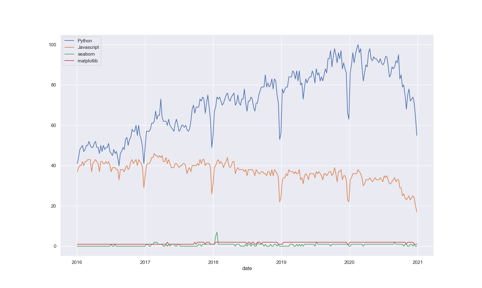
In this article we'll show you how to scrape and visualize Google trends data. We'll get our data using pytrends, an unofficial Google Trends API. We'll then visualize the data using seaborn, a Matplotlib-based library.
Some experience with Python and data visualizations will be helpful when you tackle this tutorial, but not essential.
Let's get started.
Set up
We'll begin by installing the modules we need. Type the following into your terminal:
pip install pytrends
pip install seaborn
Since seaborn is built on top of Matplotlib, it will install the other required dependencies for us (numpy, scipy, pandas and matplotlib). We won't get into using all of those, but it is good to be aware of them.
Now create your Python file. Give it a name, like ‘graphs.py’, but don’t name it the same as any of the modules you’re importing (‘seaborn.py’ or ‘pytrends.py’) to avoid attribute and circular import errors.
At the top of your Python file, import the modules with the following code:
import seaborn
import matplotlib.pyplot as plt
import pytrends
from pytrends.request import TrendReq
Let's include a plan of action in our script. Add this basic outline as multi-line comments:
'''
1. Connect to Google Trends.
'''

'''
2. Scrape data.
'''

'''
3. Process and clean data.
'''

'''
4. Visualize data.
'''
Connecting to Google Trends
Add the following code under the first comment to connect to Google Trends:
pytrends = TrendReq()
Data scraping
PyTrends uses pytrends.build_payload() to scrape our data from Google. Before we can build our payload, we need to supply PyTrends with keywords for the data we want.
We can supply just one keyword or multiple keywords, so let's create a function to dynamically get these keywords for us. Write the following code:
kw_list = []

while True:
    kw = input("Keyword:        (Enter '0' to proceed) \n> ")

    if kw == str(0):
        break
    else:
        kw_list.append(kw)
while loop with a condition of True is automatically activated when Python gets to that line. This way, Python will continue asking us for and storing the keywords we enter, until we enter the number 0 to stop the loop.
Now we can build our payload and query the data we need. In this example, we'll query interest over time data. Here's the code:
pytrends.build_payload(kw_list, geo='', timeframe='2016-01-01 2020-12-31')

keyword_interest = pytrends.interest_over_time()
When building our payload, we use geo='' to specify that we don't want region-specific data, and specify timeframe to 5 years beginning in 2016. PyTrends's interest_over_time() is one of the methods we can use to get specific data, in this case the search activity for our keywords.
Data cleanup
Next we can clean up our data and make sure it's ready to be visualized. Pytrends conveniently returns our data in a pandas dataframe, essentially a table, which makes it relatively easy to manipulate and plot. Type in the following:
print(keyword_interest.head())
del keyword_interest['isPartial']
First, we print the top part of our table using .head(), one of the many pandas methods. Then we delete the extra isPartial column from our table - we don't need to plot that data.
Run the code to confirm. You can then add another print(time_interest.head()) statement to confirm that the extra column is gone.
Visualization
Now that our data is ready, let's go ahead and use seaborn to visualize it. Write the following code in the last section:
seaborn.set_theme(style="darkgrid")
ax = seaborn.lineplot(data=keyword_interest)

legend = ax.legend()

for i in range(len(kw_list)):
    ax.lines[i].set_linestyle("-")
    legend.get_lines()[i].set_linestyle("-")

plt.show()
- Seaborn visualizations are appealing by default. However, here we set a different theme as it might suit the style of our current data more - this of course is personal preference and so, any or no theme at all is okay.
- Passing in our data as a parameter, we use
seaborn.lineplot()to plot the data in a way that suits our needs. We then save this plot into anaxvariable. - From our
axvariable we can access the legend and the line styles. We then use a loop (based on the number of keywords in ourkw_list) to change every line style from a dotted line to a straight line on the plot and legend. - Finally, we use
plt.show()to see our plot.
If you run the code now, a graph should appear on your screen.
Extra
Say you get tired of pressing the "Enter" key after every keyword and you want to enter all of them in one line. How would you go about doing that? What if you want to separate the list using a comma? Or a 'vs.'? Or either? Try that out on your own and see if you can achieve it.